The Cornell Cooperative Extension Wordmark
A wordmark is a typographic treatment of the name of a company, institution or product name used for identification and branding. Our wordmark is the primary visual representation of our brand. It acts as our signature and our logo. That’s why it’s essential that we treat our mark consistently across all media. This page includes:
- Wordmark Downloads
- Wordmark Variations
- Fonts
- Colors
- Spacing and Cobranding Guidelines
- Using the Cornell Seal
- Wordmark don'ts
With questions for help with a branding and design question please reach out!
Wordmark Downloads
Wordmarks are available for each CCE Association, Ag Team, and select programs. With questions, or to request a new wordmark for your program please contact cce-communications@cornell.edu.
This version does not include any program, team, or county name and is available in a three-lined stacked version. Download the Cornell Cooperative Extension Wordmark versions here.
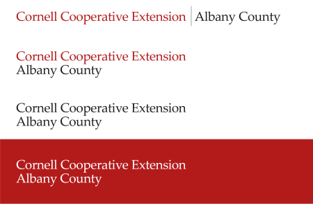
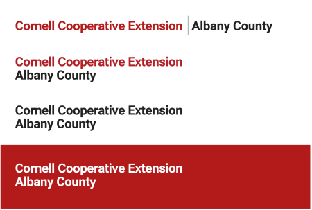
Wordmark Variations
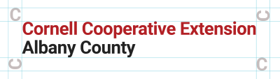
The CCE wordmark is available in several configurations. As an example, all of the options available for Albany County's wordmark are shown below.
Classic wordmark variations
Modern wordmark variations
In addition to the variations displayed above, the CCE wordmark without a program, association or team name can also be displayed in three lines as illustrated below:
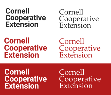
Fonts
The classic wordmark uses Palatino Linotype font. Palatino linotype is included in Microsoft Office programs. If you have MS programs installed on your computer this font will be available automatically and can also be used in Adobe programs.
The modern wordmark utilizes the Roboto Bold font which you can download for free.
View complementary font recommendations
Colors
Each wordmark is available in color, grey or white. Due to discrepancies in the way that colors appear onscreen and in print, the colors for each respective use differ. If your document will be printed and distributed, the print colors should be used. If your document will primarily be viewed on a screen, the web version should be used.
Carnellian
- PMS 187 CMYK (0,100,79,20)
- CMYK (0,100,79,20)
Web
- #B31B1B
- RGB (179,27,27)
Dark Grey
- PMS COOL GREY 11
- CMYK (48,36,24,66)
Web
- #222222
- RGB (34,34,34)
White
- CMYK (0,0,0,0)
Web
- #FFFFFF
- RGB (255,255,255)
View complementary color recommendations
Spacing and cobranding guidelines
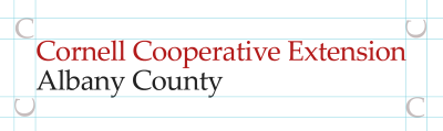
To protect the legibility and visual integrity of the wordmark, always observe a margin of clear space around it. Use the height of the capital “C” in Cornell to measure around the wordmark.
When sharing space with another institution or brand, observe mutual clear space when positioning other logos near the CCE wordmark. Try to align the center of each image. See below for more guidance on using the CCE wordmark with the Cornell Seal.
Using the Cornell Seal
You may use the Cornell Seal in your applications by following the Cornell University Brand Guidelines:
Please discontinue use of the "three-line lockup" logo pictured below. This version is no longer compliant. If you are unsure about a specific use of the Cornell seal, please reach out to University Relations for approval.

Wordmark Don'ts
- Do not modify, stretch, deform, warp or rotate.
- Do not recolor or outline.
- Do not use drop shadows or other image effects.
- Do not break or rearrange wordmark elements.
- Do not violate minimum clear space.
- Do not replace the delta with any other symbols, or use the delta as a symbol in any other words.