These color and font recommendations are intended to help you streamline your CCE branded materials. These colors and fonts may be used to complement materials that include the CCE Wordmark and/or Cornell Seal. For assistance applying these recommendations to your digital or print CCE branded asset, please reach out to cce-communications@cornell.edu.
Fonts
Font can be used to express the CCE brand identity in print and online materials. Below are recommended use-cases for each font type.
Primary Fonts
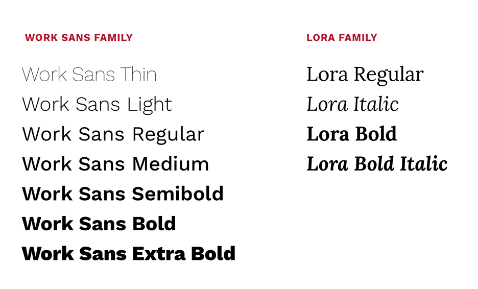
The CCE brand includes CALS primary fonts Work Sans and Lora which can be used for headline and body text. Each font is free and web-accessible.

Alternate Fonts
In situations where documents are shared digitally in an editable format (.doc, .ppt, Outlook emails, for example), fonts and formatting will be dependent on the system fonts installed on the user’s computer or device or the available web fonts. In these cases, it is recommended that you use Arial in place of Work Sans and Georgia in place of Lora, which are the web fonts that are most widely available by default on most devices.
Wordmark Fonts
The CCE Wordmark is available in two fonts. The classic wordmark uses Palatino Linotype font. Palatino Linotype is included in Microsoft Office programs. If you have MS programs installed on your computer this font will be available automatically and can also be used in Adobe programs. The modern wordmark utilizes the Roboto Bold font which you can download here for free. These fonts may only be used for the CCE Wordmark.
Font Dos and Don’ts for Print and Digital Assets
- Do use consistent heading and body text throughout your print or digital brand asset
- Do Left-align text blocks whenever possible. Do not force-justify text blocks.
- Do limit your compositions to two or three type styles and a limited number of type sizes. Be consistent with type sizes for headers, body text, and captions in a document.
- Do only use type over an image if all the type is legible.
- Don’t embellish type with drop shadows, outlines, or noticeable photodarkening.
- Do keep an ample amount of clear space around text blocks and images - try not to crowd your compositions.
- Do ensure that your asset is web-accessible by utilizing a heading structure and hyperlinks (for digital assets).
These recommendations are adapted from Cornell CALS Topography Guidelines.
Colors
The following color pallets are recommended for use when designing CCE branded print or web materials. Please use a color contrast checker, such as this one from WebAIM, to ensure that the font and background colors that you select have sufficient contrast.
The colors in the primary pallet, Carnellian, dark grey, and white are used in the CCE Wordmark and can be used for other fonts, graphics, and design elements in digital or print assets. These colors are consistent with the Cornell University Primary Pallet.
Carnellian
- PMS 187
- CMYK (0/100/79/20)
Web
- #B31B1B
- RGB (179,27,27)
Dark Grey
- PMS COOL GREY 11
- CMYK (48/36/24/66)
- Grey 85
Web
- #222222
- RGB (34,34,34)
White
- Opaque white
- CMYK (0/0/0/0)
Web
- #FFFFFF
- RGB (255,255,255)
The secondary pallet, black, light grey, and ecru, may be used sparingly to complement the primary color pallet or complement 4-H Green (PMS 347; CMYK 100/0/90/0; RGB 51, 153, 102; #339966).
Ecru
- CMYK (17/19/33/0)
Web
- #D5C5AC
- RGB: (213, 197, 172)
Light Grey
- CMYK (67/60/59/44)
Web
- #444444
- RGB (68,68,68)
Black
- CMYK (0/0/0/100)
Web
- #000000
- RGB (0,0,0)